A deep-dive into Sparklines - An alternative to figures
Sometimes, you’ll want to convey (or remind) the reader about some fact or data that is more intuitively understood when represented graphically. For this reason, we have figures: pictures that are signposted by a label. Generally, they will take up enough space (or are difficult enough to typeset) that consideration must be put into whether the information is significant enough to warrant the costs. For this reason, some journals even place a limit on the number of tables or figures.
This is where sparklines make their entrance. For quickly graphically representing a subset or feature of previously presented data, a text-sized plot without axes is included in the text.
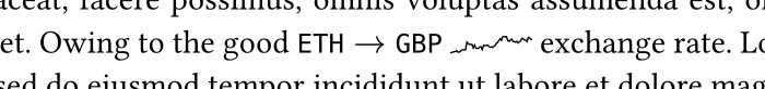
For the purposes of illustration, I’m using ETH to GBP exchange rates to simulate actual data. The only matter of note was that when importing the data from the CSV to Typst, and owing to the lack of named capture groups, the code that casts YYYY-MM-DD to date is atrocious.
datetime(
    ..("year", "month", "day").zip(
        it.Date.matches(
            regex("(\d{4})-(\d{2})-(\d{2})")
        ).first().captures
    ).fold(
        (:),
        (acc, it) => (
            ..acc,
            (it.first()): int(it.last())
        )
    )
)
Text sized plots
One of the distinguishing features of sparklines is that when they are in the body of a text, they do not catch the eye more than is absolutely necessary. They don’t have a luminance that is darker than the text, they are sized in proportion to the glyphs that surround them, and do not affect the line spacing. Now that we’ve set our goals, let’s get started.
The lowest hanging fruit is that, no matter how they are encoded in the source file, they have a space width on either side. This can be achieved by nesting space symbols within weak 0em horizontal spacing, like so
h(0em, weak: true) + sym.space + box({

}) + sym.space + h(0em, weak: true)
To get our plots text-sized, I’m going to scale the x and y according to the spread of the data and the given width and height lengths
#let sparkline(
  data,
  height: 1em,
  width: 1em,
) = h(0em, weak: true) + sym.space + box({

  // Calculate the spread of data
  let xs = data.map(it=>it.first())
  let x-min = calc.min(..xs)
  let x-max = calc.max(..xs)

  let ys = data.map(it=>it.last())
  let y-min = calc.min(..ys)
  let y-max = calc.max(..ys)

  cetz.canvas(
    length: 1em,
    {
      cetz.draw.scale(
        x: width / ((x-max - x-min) * 1em),
        y: height / (2*(y-max - y-min) * 1em)
      )
      cetz.draw.line(..data)
    }
  )
}) + sym.space + h(0em, weak: true)
We’ve handed almost complete control of the width and the height over to the call-site as we can’t make any general assumptions about the data that is to be rendered. All we truly can say is that someone wants to render an arbitrary amount of data points in a given amount of space. Equally, we can’t make assumptions on how noisy the data is, and so we can’t automatically handle the stroke thickness. As we’re going to be letting the call-site handle that we may as well give them control over the entire style, seeing as we aren’t doing anything specific
#let sparkline(
  data,
  height: 1em,
  width: 1em,
  style: (stroke: 0.4pt)
) = h(0em, weak: true) + sym.space + box({

  let xs = data.map(it=>it.first())
  let x-min = calc.min(..xs)
  let x-max = calc.max(..xs)

  let ys = data.map(it=>it.last())
  let y-min = calc.min(..ys)
  let y-max = calc.max(..ys)

  cetz.canvas(
    length: 1em,
    {
      cetz.draw.set-style(..style)
      cetz.draw.scale(
        x: width / ((x-max - x-min ) * 1em),
        y: height / (2*(y-max - y-min) * 1em)
      )
      cetz.draw.line(..data)
    }
  )
}) + sym.space + h(0em, weak: true)
One size doesn’t fit all
We’ve managed to make a simple text sized plot of a line, but that won’t suit every instance where short-hand graphical representations would be beneficial. Do we want to put to coloured marks on the ends of the line? Maybe we want a bar chart instead? Should the area below be shaded? We can make our code more general by shuffling some code around
#let line(data, (x-min, x-max), (y-min, y-max)) = cetz.draw.line(
  ..data
)

#let make(
  data,
  height: 1em,
  width: 1em,
  style: (stroke: 0.4pt),
  draw: (line,)
) = h(0em, weak: true) + sym.space + box({

  let xs = data.map(it=>it.first())
  let x-min = calc.min(..xs)
  let x-max = calc.max(..xs)

  let ys = data.map(it=>it.last())
  let y-min = calc.min(..ys)
  let y-max = calc.max(..ys)

  cetz.canvas(
    length: 1em,
    {
      cetz.draw.set-style(stroke: stroke, ..style)
      cetz.draw.scale(
        x: width / ((x-max - x-min ) * 1em),
        y: height / (2*(y-max - y-min) * 1em)
      )
      for cmd in draw {
        cmd(data, (x-min, x-max), (y-min, y-max))
      }
    }
  )
}) + sym.space + h(0em, weak: true)
We now have an input argument draw that is an array of draw commands, which take positional arguments data and min-max tuples for the x-axis and y-axis respectively. Now if someone wants something non-standard, they have the means to create it and specify it (or several). I’ve made a quick generator function for a draw command that does a vertical line over the whole y-domain with a given style:
// The return type is function!
#let vline(x, ..style) = (data, (x-min, x-max), (y-min, y-max)) => {
cetz.draw.line(
(x, y-min),
(x, y-max),
..style
)
}
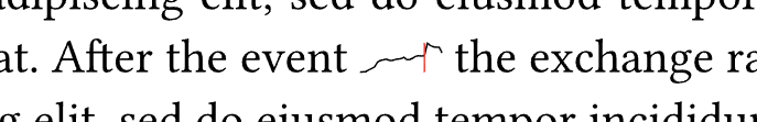
#sparkline.make(
data.converted.filter(it=>(it.first()>290 and it.first() < 320 )),
width: 1.7em,
height: 1.2em,
draw: (
sparkline.line,
vline(313, stroke: (thickness: 0.4pt, paint: red))
)
)
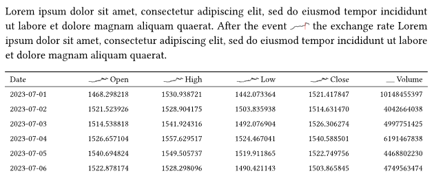
Using a couple helper functions along the way, they are easy enough to include in table headings:
// Our table likes content instead of datetime for rendering
#let converted = converted.map((it)=>(:
  ..it,
  Date-Display: it.Date.display()
))

// Simple (x,y) map utility function
#let series(key) = converted.map(
  (it) => (
    it.Date.ordinal() + (it.Date.year() - 2023) * 365,
    float(it.at(key))
  )
)

#import "../packages/booktabs/lib.typ" as booktabs

// Make defining columns a bit easier when we know what we want
#let column(key, display, width: 1em) = (:
  key: "High",
  display: sparkline.make(
    width: width,
    data.series(key)
  ) + display,
  width: 1fr,
  align: right,
)

// Last week's project makes an appearance!
#booktabs.rigor.make(
  columns: (
    (
      key: "Date-Display",
      display: [Date],
      gutter: 1em
    ),
    column("Open", width: 2.3em)[Open],
    column("High", width: 2.3em)[High],
    column("Low", width: 2.6em)[Low],
    column("Close", width: 2.1em)[Close],
    column("Volume")[Volume]
  ),
  data: data.converted
)
Closing thoughts
Playing around with sparklines has taught me a great deal about imagining “average use cases” and how best to implement them. The other thing it taught me is that my booktabs code from the last blog post suffers horribly for large tables, so it will probably get revisited.
One of the design limitations I ran into was that from the get-go, we assumed that we wanted to display (x,y) data, which isn’t always the case. Marks on the plots get distorted due to the scaling transformations we applied, even when transform-shape is set to false, but I understand that this should be fixed in the next cetz release.
There does seem to be an issue for the “Volume” column sparkline, and I haven’t managed to work out what it is.